
Enterprise
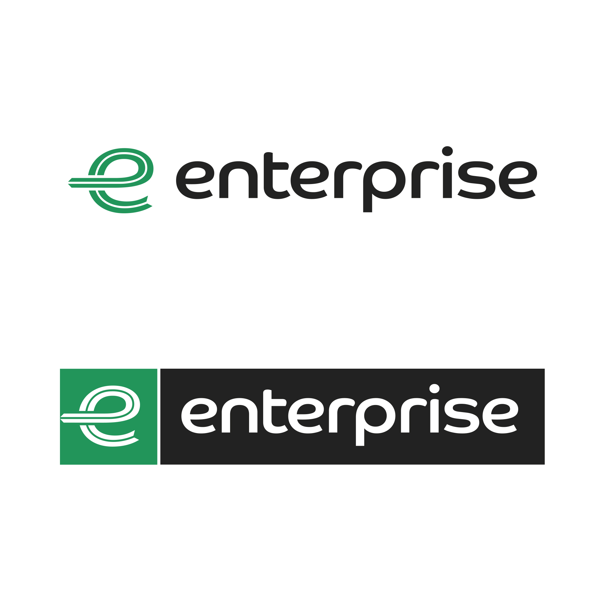
Isolate the typemark from the e motif.
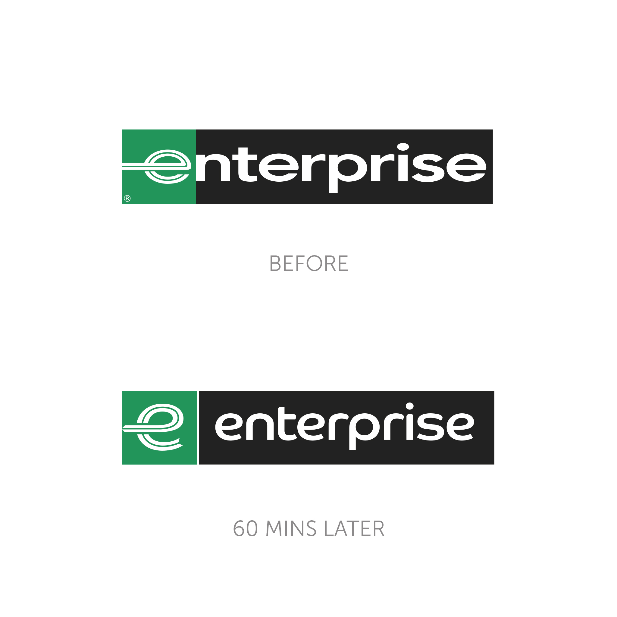
This is a brandmark that has frustrated us for a while. The use of the e motif replacing the e in enterprise looks clunky and really awkward. The stretched typeface and the bad spacing add to the dated and uncomfortable feel.
What we did...
We have refreshed the e motif to be softer and more modern, whilst isolating it from the typemark to act as an abbreviation of the brandmark, as they do currently. We have also changed the typeface to a more approacheable and softer version. This softens the whole appearance and makes it feel more welcoming and fresher in feel.


60min Makeovers is an internal Truth project where we take a popular brand and refresh it in under an hour. It is just for fun and is undertaken with no insight or knowledge of the brand's future strategy. It is purely cosmetic and for our own pleasure.