
Schär
Founded in 1979 and named after Dr. Anton Schär – who had pioneered specialist health food for children since 1922 – Schär is the world’s first specialist gluten-free food brand.
Created specifically to combat coeliac disease (an auto-immune digestive condition), Schär offer a gluten-free alternative to wheat, rye and barley-based products such as breads, biscuits and pasta. Schär also invests heavily in research and development utilising its global network of over 70,000 coeliac sufferers.
Why?
To this day coeliac disease is not fully understood, the condition is estimated to affect every one in 100 people – and the number is growing with each new generation. Simple economics dictates that as the number of sufferers grows, so does the market – the advent of gluten-free living as a supermarket staple is on the horizon if indeed, it is not already here.
As a designer who has previously worked in the sector and is a coeliac sufferer, this is a market I have some insight into. Schär make great products and their commitment to creating food that is not only healthy but flavoursome feels somewhat let down by a brand that could use a little TLC. As a specialist health brand, it may be tempting to rest comfortably in the knowledge that by providing a product your customers have to buy (or cut out of their diet) you don’t need to place such an emphasis on design, but with an expanding audience comes increased competition.
Schär has a large presence on the ‘free-from’ aisle and are known for their quality, but alternatives do exist. Other market leaders in the sector (such as Genius and Udi’s) have embraced design in recent years, furthering shelf appeal and brand awareness, leaving Schär to hold its own, largely by reputation alone. Supermarkets have also built upon their own-label ranges, under-cutting market leaders on price. In a growing marketplace… perhaps it is time for Schär to respond.

What we did
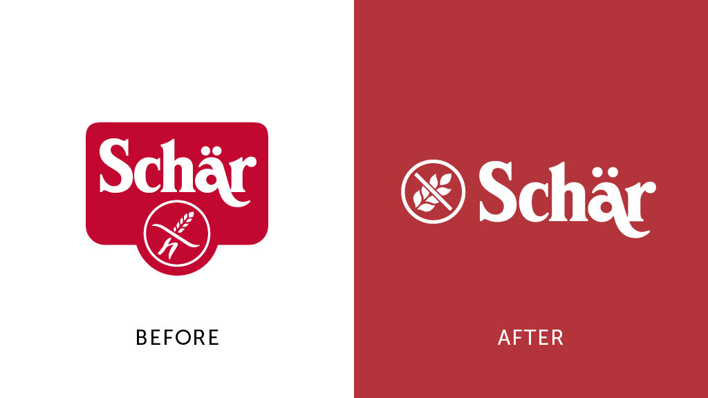
We’ve subtly tweaked the brand-mark, adjusting the kerning, the relationship of the umlaut and evolved the cumbersome holding device, but largely the mark has remained intact to build on the equity of the brand. The gluten-free market has been re-drawn and now has the freedom to work with the logo or as a symbol in its own right.
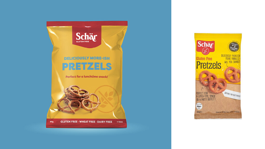
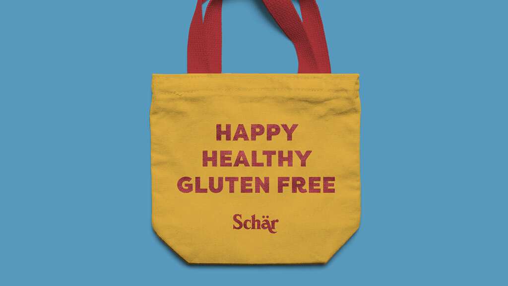
The new palette uses warmer reds and yellows paired with playful and bold typography to create a more inviting and friendly brand, personifying health and happiness. The packaging, which featured a large degree of ‘feature creep’, has been modernised and simplified, creating a clear hierarchy that allows the products to shine.
60min Makeovers is an internal Truth project where we take a popular brand and refresh it in under an hour. It is just for fun and is undertaken with no insight or knowledge of the brand's future strategy. It is purely cosmetic and for our own pleasure.