Wikipedia
Developing a more intelligent brand mark.
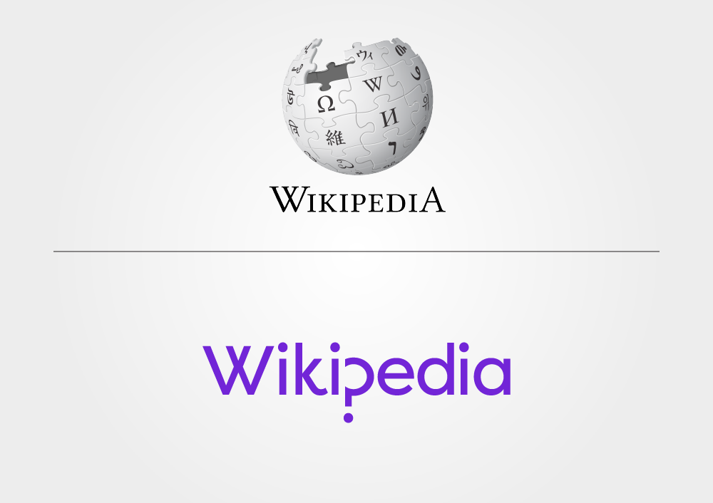
The Wikipedia before and after.
As the world’s most popular collaborative digital encyclopaedia, Wikipedia is a house-hold name, and should feel like one. The original logo (designed in 2003 and subsequently refreshed) features a jigsaw piece globe and a classic serif typeface, but arguably lacks the modernity and presence of a digital giant.
What we did...
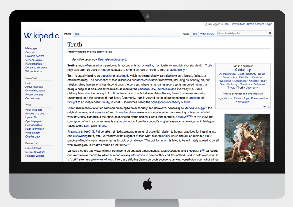
Our refresh creates a bold typemark for the brand, featuring a subtle symbol at its heart. Through the stylised letter ‘p’ motif we provoke thought from the audience, and invite them to collaborate. The motif is the unique signifier for the brand, dropping the cumbersome and detailed globe in favour of this simplistic yet intelligent device.
In reference to the diversity of encyclopaedias the brand does not feature a fixed colour palette, but sees a departure from the stark black and white in favour of contemporary tones.
In just a very short period of crafting time, the brand is hinting at its potential to sit naturally with some of digital media’s biggest players.
60min Makeovers is an internal Truth project where we take a popular brand and refresh it in under an hour. It is just for fun and is undertaken with no insight or knowledge of the brand's future strategy. It is purely cosmetic and for our own pleasure.


