
Panini
Refresh the brandmark to reflect the brand’s Italian sporting heritage.
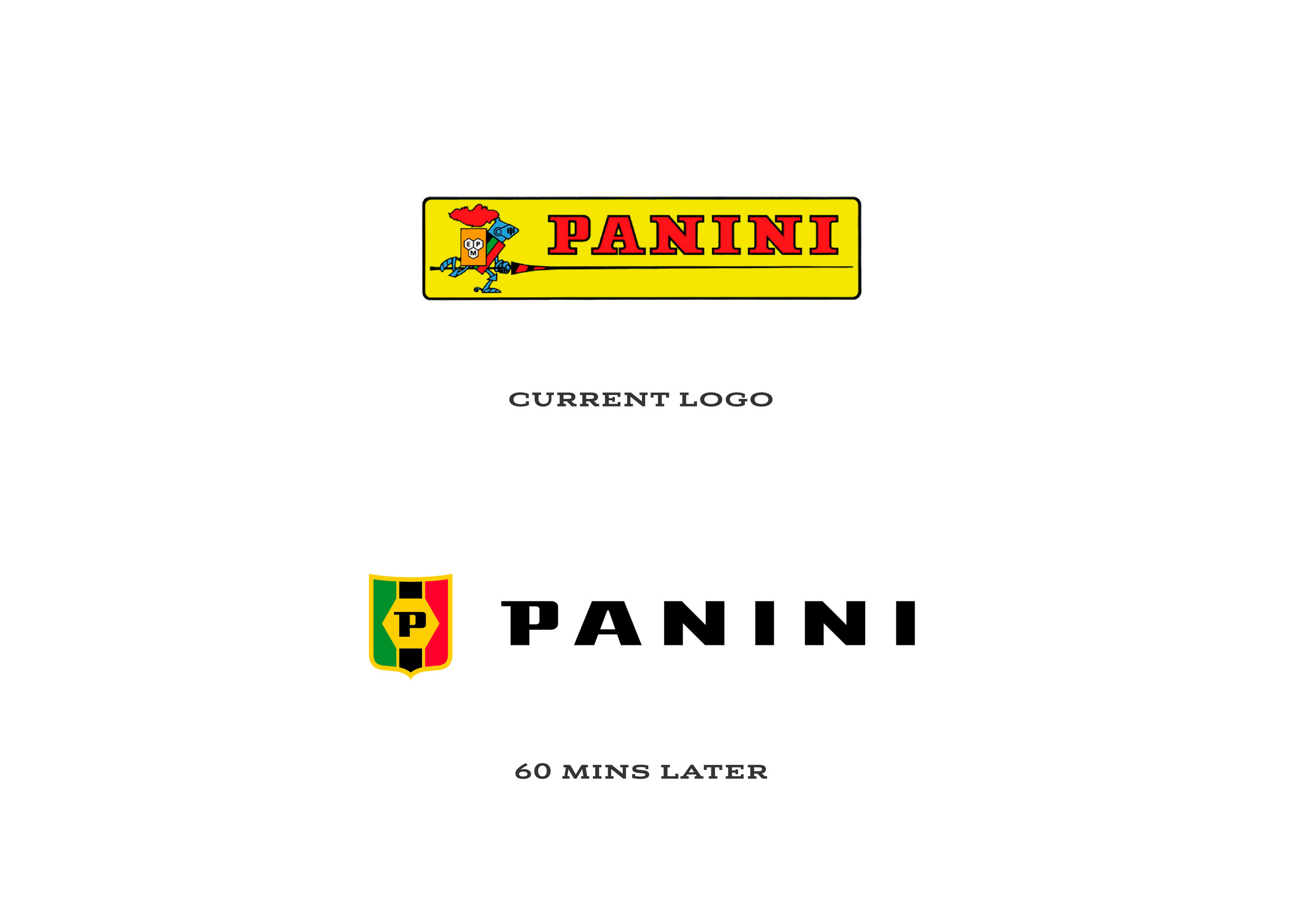
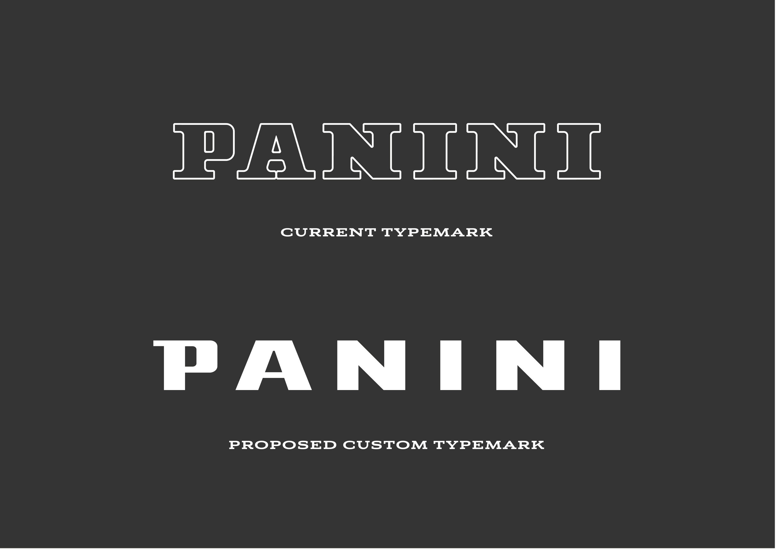
Panini is a legendary brand most male adults will remember from our childhood obsessions with football stickers. However, the brand mark remains relatively unchanged for decades. The logo and colour palette is tired and doesn't reflect or appeal to the fanbase of modern sports.
What we did...
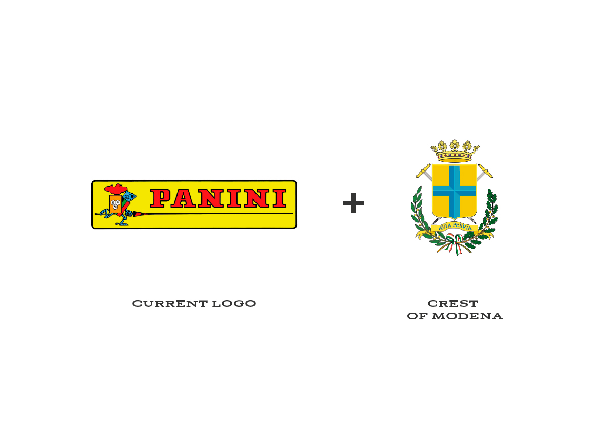
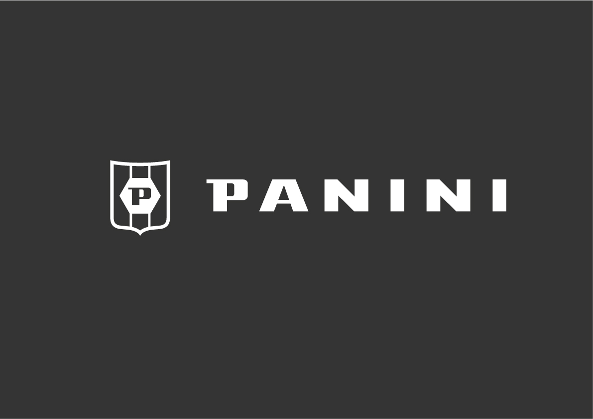
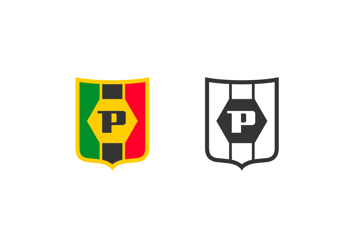
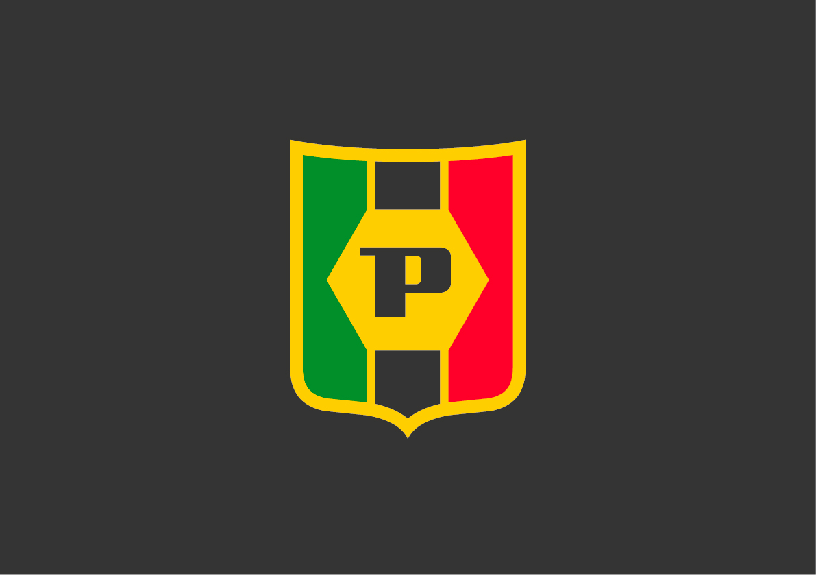
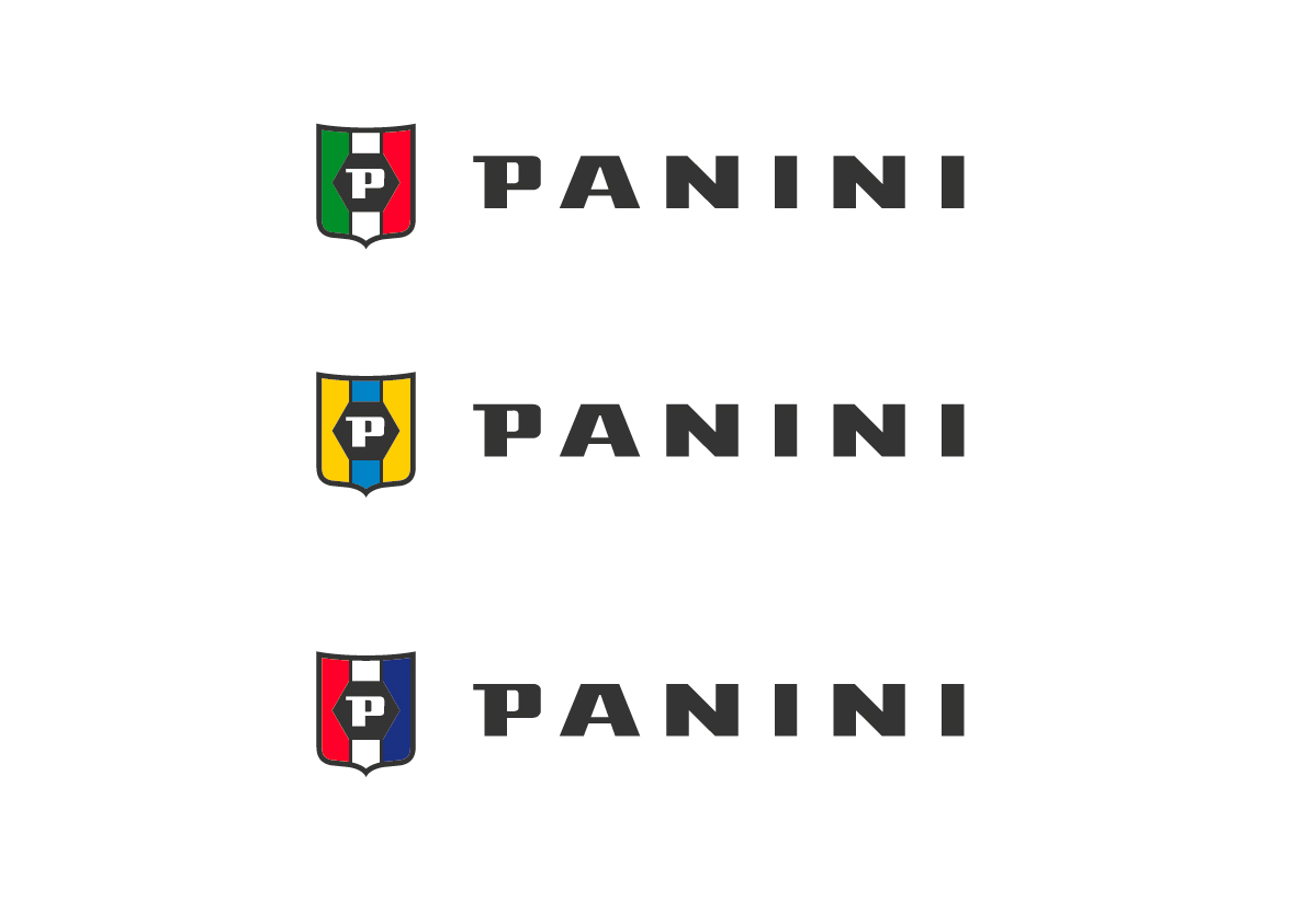
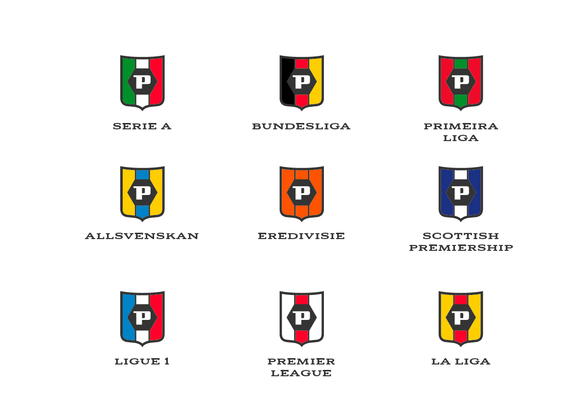
We have simplified the knight motif down to three of its elements – The Shield, The Three Coloured Stripes and The Hexagon containing the initial P. We then combined these elements with a shield shape taken from the Crest of Modena (the Italian city where they were founded in 1960 and are still based today). The result is a Panini sporting crest that feels more appropriate for a brand so embedded in sport. We combined this with a custom type mark based on the character shapes of the original historical type, being careful to retain the Italian feel but in a more contemporary way.
It was done quickly, but we feel we have more aligned the mark to perform better in the sporting arena.
60min Makeovers is an internal Truth project where we take a popular brand and refresh it in under an hour. It is just for fun and is undertaken with no insight or knowledge of the brand's future strategy. It is purely cosmetic and for our own pleasure.